Web Accessibility: Essential, Not Optional
"The power of the Web is in its universality. Access by everyone regardless of disability is an essential aspect." - Tim Berners-Lee
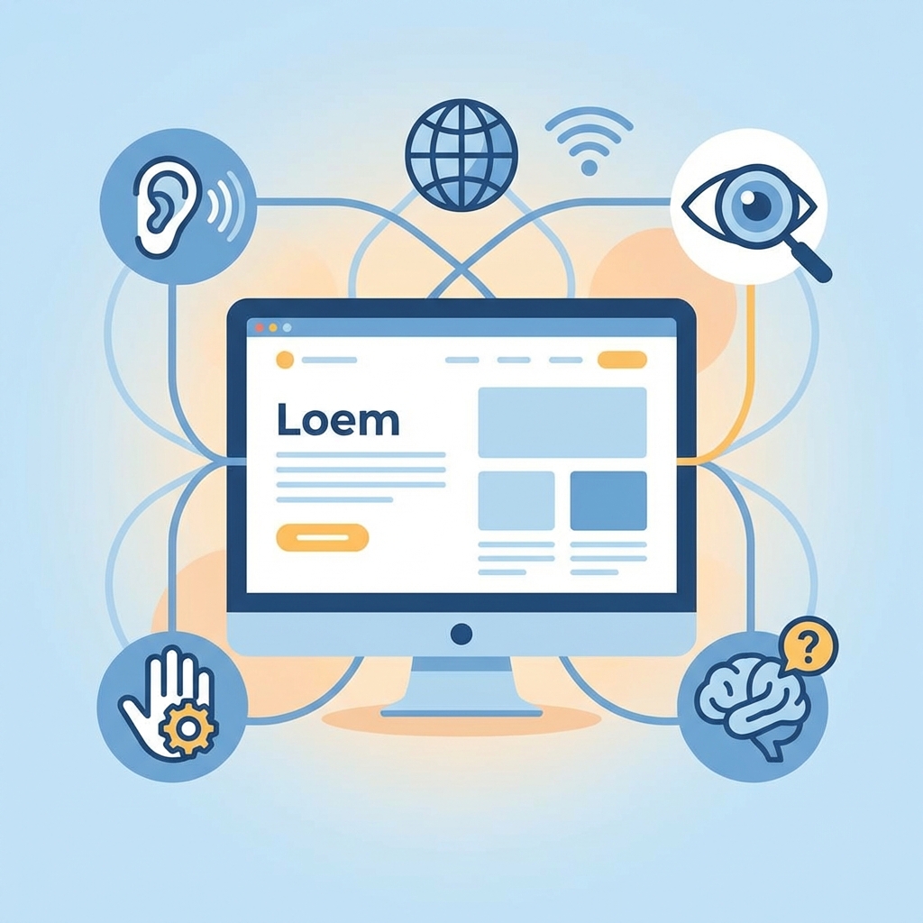
Web Accessibility (A11y) ensures that users with disabilities, the elderly, or anyone experiencing temporary limitations can use website functions equally. One of the core values prioritized while developing ConverterGo was this Accessibility.
1. The Importance of Semantic Tags
The foundation of web standards is using tags that match their meaning. A site cluttered with simple <div> tags makes it difficult for screen readers (software that reads the screen for visually impaired users) to understand the structure.
ConverterGo follows this semantic structure:
<header>: Site navigation and logo<main>: Core content area<article>: Independent blog posts or cards<footer>: Copyright information and related links
Structuring content this way allows screen reader users to efficiently navigate using features like "Skip to Main Content".
2. ARIA (Accessible Rich Internet Applications)
Interaction elements that cannot be fully described by HTML tags alone were supplemented using ARIA attributes.
Case Study: Language Switcher
The language switch button on the top right consists only of an icon, which is visually clear but might not convey meaning to a screen reader. To address this, we added an aria-label.
<Button variant="ghost" size="icon" aria-label="Change Language">
  <Languages className="h-5 w-5" />
</Button>
With this, the screen reader clearly announces it as a "Change Language Button".
3. Keyboard Accessibility
Users who cannot use a mouse browse the web using only the Tab key on the keyboard. All features of ConverterGo work perfectly with just a keyboard.
- Focus Indicator: A clear blue border (Focus Ring) indicates exactly where you are when you press
Tab. - Logical Order: Regardless of the visual layout, the HTML DOM order interacts logically so that the tab sequence does not become tangled.
4. Color Contrast
For users with low vision or color blindness, text and background contrast ratios were adjusted to meet WCAG 2.1 AA standards (4.5:1 or higher).
Specifically, we utilized the Shadcn UI design system's verified color palette to ensure text is clearly visible in both light and dark modes. For instance, warning messages are not just displayed in red but also include icons, ensuring users who cannot distinguish colors can still perceive the warning.
Adhering to web accessibility goes beyond simply complying with legal obligations; it is about providing a better experience for more users. Search engines (SEO) also rank accessible sites higher.
We hope to see a discrimination-free web service that anyone can use conveniently.